Online ordering
Client:
Cacao Tree Cafe
Industry:
Vegan food
Role:
UX Designer
Background:
Online ordering has grown to be around 60% of Cacao Tree’s total sales, which has made them want to optimize their branding and online ordering experience.
They have built a very loyal customer base of food-conscious individuals by providing high-quality food, local ingredients, and menu transparency. Whether their customers are nondairy, vegetarian, vegan, have food intolerances or severe food allergies, each customer has a very important, yet different goal when it comes to what food they eat or, potentially, how they order it.
Project constraints:
Will be using food images the client provides.
Working within a 3-month timeline.
Overcoming my own biases of the customer base as a former server at their sister location.

-

The problem
Users with dietary concerns feel it’s unsafe and more difficult to order food online.
-

The solution
Create a responsive site that is optimized for Cacao Tree’s main customer personas: food intolerances/allergies, vegetarian, and vegan/nondairy.
-

The process
Secondary research
Competitive analysis
Focus groups
Sitemap and task flow
Prototyping
Usability test with A/B testing -

The results
Cacao Tree’s new site creates a user experience focused on users safely ordering food for their dietary concern or preferences allowing them to feel more confident when ordering from Cacao Tree Cafe.
Discovery
Discovery
Objectives
Understand how each group goes about ordering food online.
Learn what each group looks for in a restaurant or cafe when ordering online.
Discover what matters most to each group while ordering food online.
Research
Methodology
To gain a deeper understanding of the objectives, I conducted secondary research, competitive analysis, and three focus groups of their current customers.
Findings
Main user goal
To be able to find and purchase a dish that they know meets their consumption needs and wants.
User groups
From analyzing patterns and themes across all methodologies I overcame my assumptions and identified two key user groups: those who choose to eat this way and those who have to eat this way.
Focus group key quotes
”I like when they have checkboxes to customize the order because they often miss what I say in the comment box.”
— Focus group participant
”It’s difficult to find safe food options in restaurants without speaking with someone. Even then, not all servers/restaurants honor the request.”
— Focus group participant
”It’s really nice to be able to get together with friends and bonding with others who have the same allergies - it’s like a little community.”
— Focus group participant
”Tend to stick with what I know that's safe and easy to order. I prefer easy customization for each dish, checkboxes. I can't trust that my comments will be honored.”
— Focus group participant
Exploration
Exploration
Understanding hierarchy
Cacao Tree’s current site did not have a well-structured or clear information hierarchy. I created a site map and task flow to ensure I had a clear understanding when ideating low-fidelity wires.
From the client, I was given a few keywords they felt described them as well as how they wanted to be perceived by their customers. I took these trigger words and expanded on them to:
sprout
harmonious
transparency
From there, I created a mood board which became the foundation for the style guide and UI kit.
The brand

I like that the concerns were already listed based on top food allergies. I felt that the business was anticipating my needs and accommodating me and making it easier to order.
— usability test participant
Materialize
Materialize
Remote usability testing
Test how users view the new brand vs the old.
Test whether users think their dietary preferences, intolerances, or allergies were taken seriously.
Test users’ confidence in their order being correct.
Objectives
Must have a dietary preference, intolerance, or allergy.
Participants
Affinity mapping
-
Unsorted
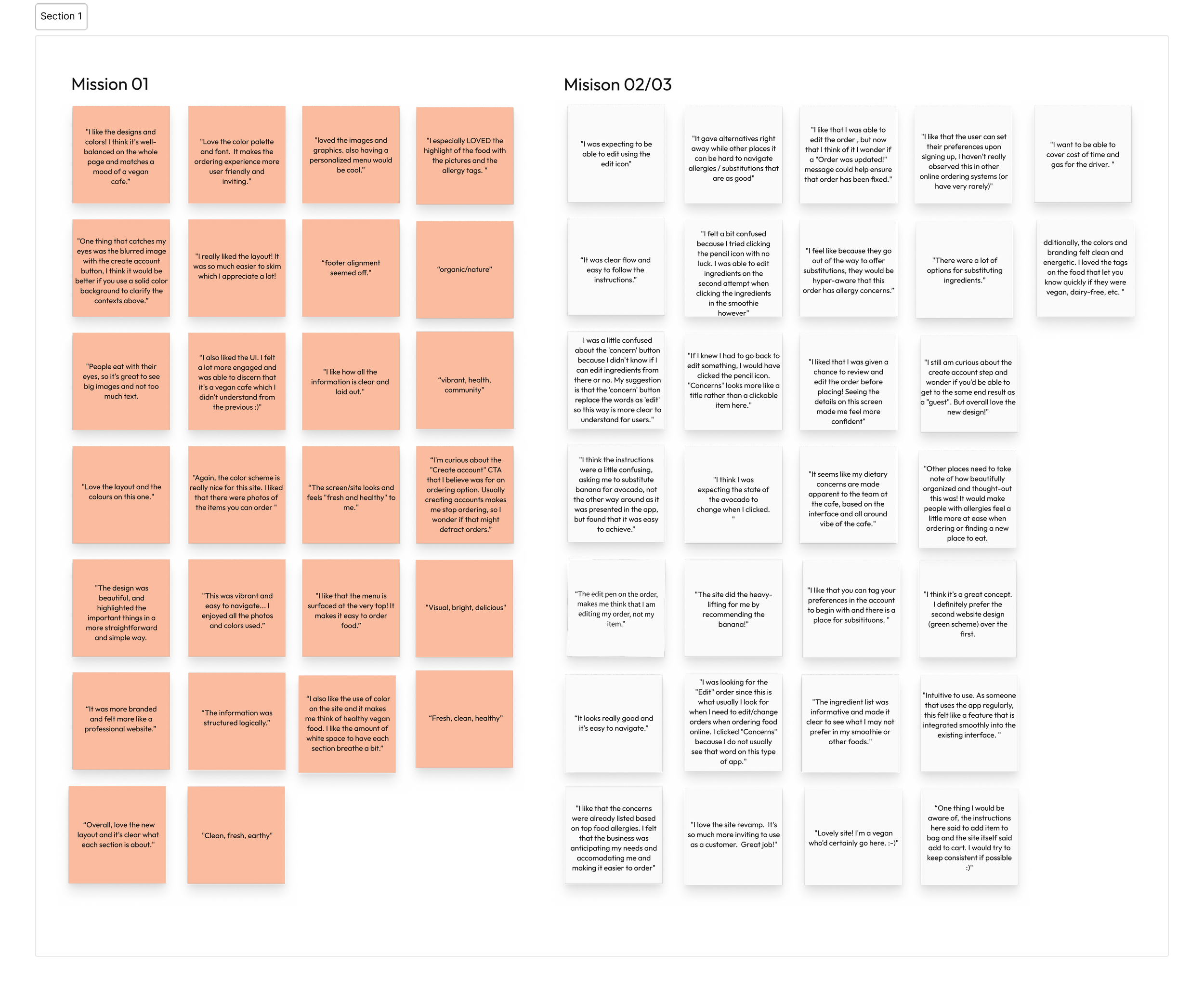
I identified any opportunities for improvement by writing down key quotes from usability test participants.

-
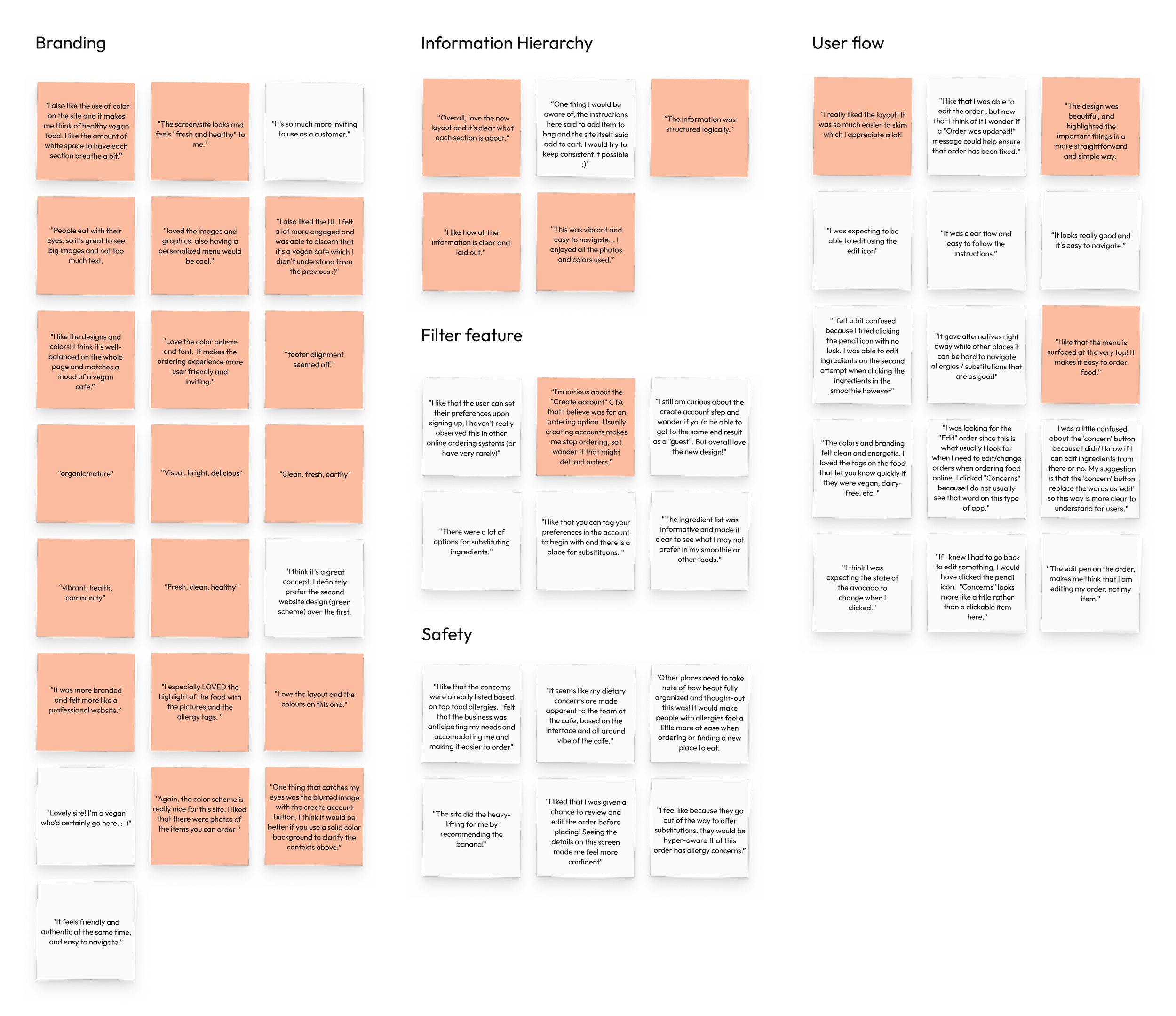
Sorted
Once I had all the key quotes made during each test, I sorted the sticky notes based on similarities and landed with these five groups:

Usability test key quotes
"I like that the user can set their preferences upon signing up; I haven't really observed this in other online ordering systems (or have very rarely)."
— Usability test participant
"The concerns were already listed based on top food allergies. I felt that the business was anticipating my needs and accommodating me and making it easier to order"
— Usability test participant
"Lovely site! I'm a vegan who'd certainly go here. It feels friendly and authentic at the same time, and easy to navigate."
— Usability test participant
"Other places need to take note of how beautifully organized & thought-out this was! It would make people with allergies feel more at ease when ordering or finding a new place to eat."
— Usability test participant
This was only the beginning
Although I've finished testing my initial research question, there’s still so much I could do if I had a bit more time:
Checkout flow
Explore the flow of a user who checks out as guest
Ingredients page
Test the performance of the ingredients page and how we could improve it.
Team page
Create the team page and test whether seeing team members pictures and bios increases user trust.

Thanks for joining me!
Like what you see? Let’s connect or explore more of my work.


