Account management
Client:
Highland Ag Solutions
Product:
Market watch
Industry:
Ag tech
Role:
UX Architect
Background:
During my time at Highland Ag Solutions, I became lead UX designer for one of their newer products. This product was revolutionizing the agriculture tech industry, but was in need of some serious UX love and attention.
Lots of user flow were not well thought through potentially creating a sense of illegitimacy. Not to mention, common flows that were used were confusing and lacked IA.
Project constraints:
Didn’t have enough time to do thorough research with users (although that was in the works)
The agriculture industry is very competitive, thus no competitor information was available to create a competitive analysis as I would’ve liked

-

The problem
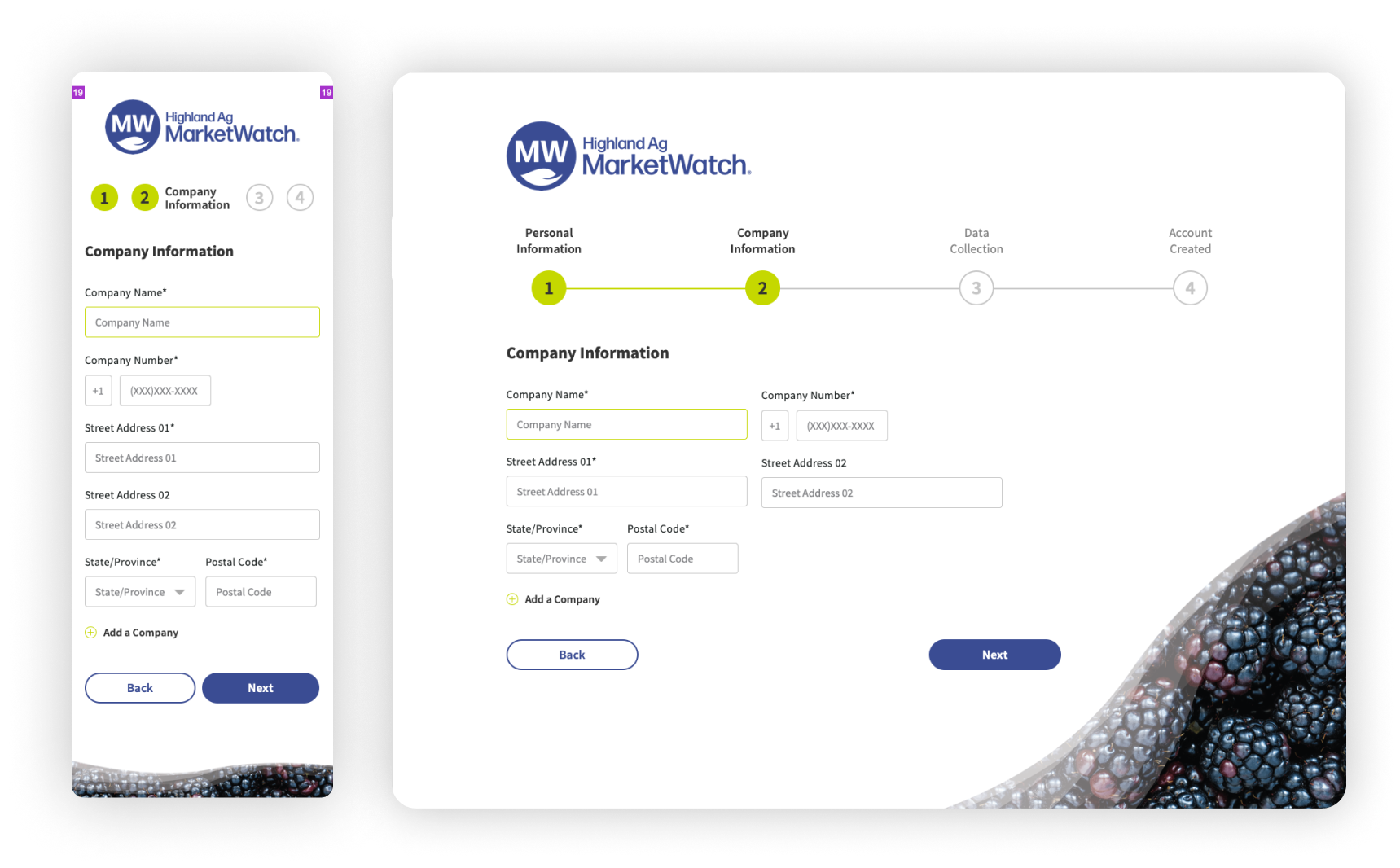
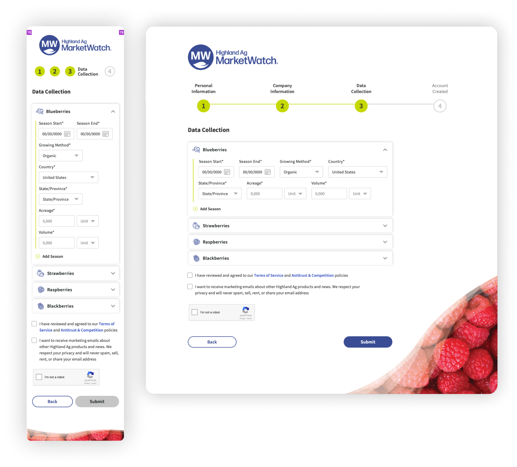
The account creation/login process for Highland Ag MarketWatch was overly complex and internally manual, leading to unnecessary user frustration.
-

The solution
Design a more automated account creation and login flow to reduce internal process time and create a seamless beginning touchpoint for its users.
-

The process
Stakeholder syncs
Secondary research
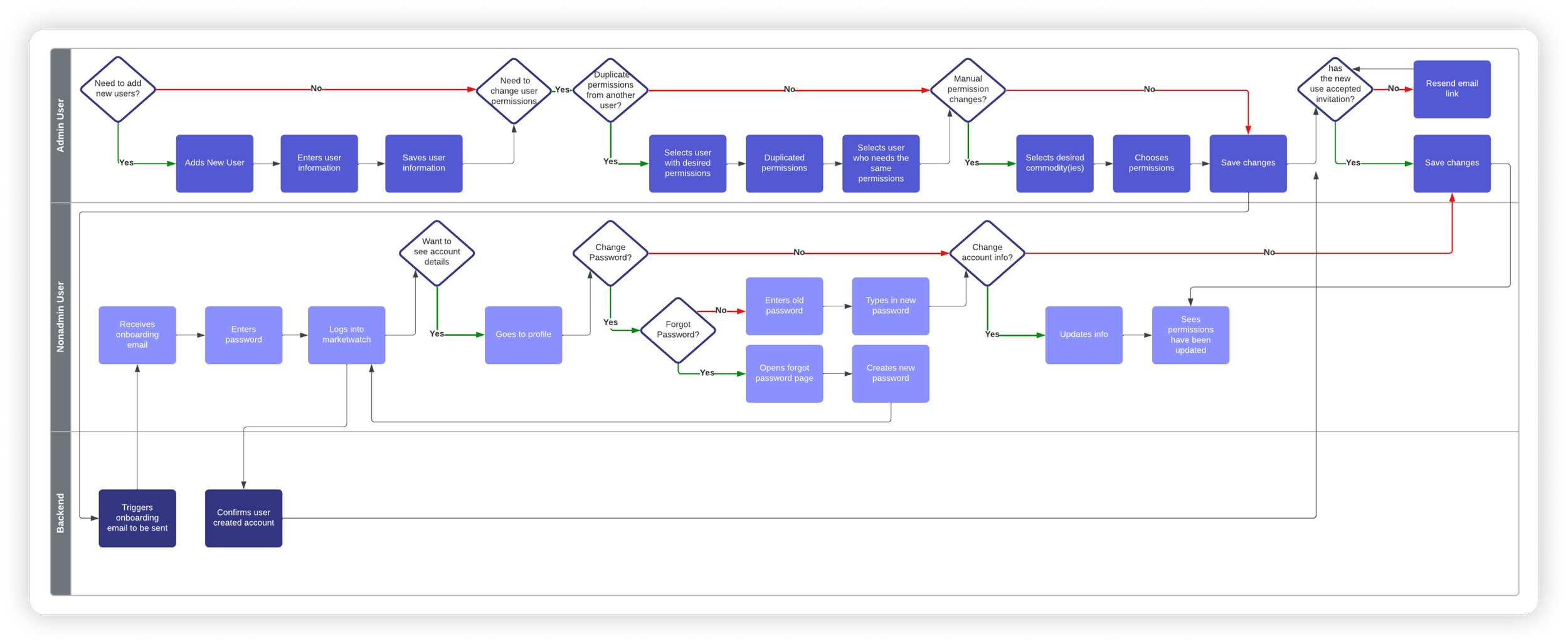
Site maps, user flows, and swimlane diagrams
Wireframe flows
Prototyping -

The results
Users can now create and manage their accounts with ease, freeing up project managers from time-consuming manual processes.
Discovery
Discovery
Secondary research + user interviews
I analyzed common user flows of big players in the tech industry to identify patterns easy learnability. I conducted interviews with various stakeholders and customers better understand how clients use MarketWatch.
Research
Constraints
Didn’t have enough time to do thorough research with users (although that was in the works)
The ag tech is very competitive, thus no competitor information was available to create a competitive analysis as I would’ve liked
Setting Expectations
I gathered my findings and set up a meeting with the stakeholders to discuss potential solutions from my research. From the site map I created, we were able to set a baseline of what the current MarketWatch page looked like and what our future was.
Meeting outcome objective: update existing flows and create new ones that would allow users to easily create and manage their MarketWatch account.
Exploration
Exploration
Complexity to clarity
What I discovered added to the intricacy of creating and signing into an account?
The current account creation flow was through email and info manually uploaded by PMs.
We needed a way for tech admin users to access different companies.
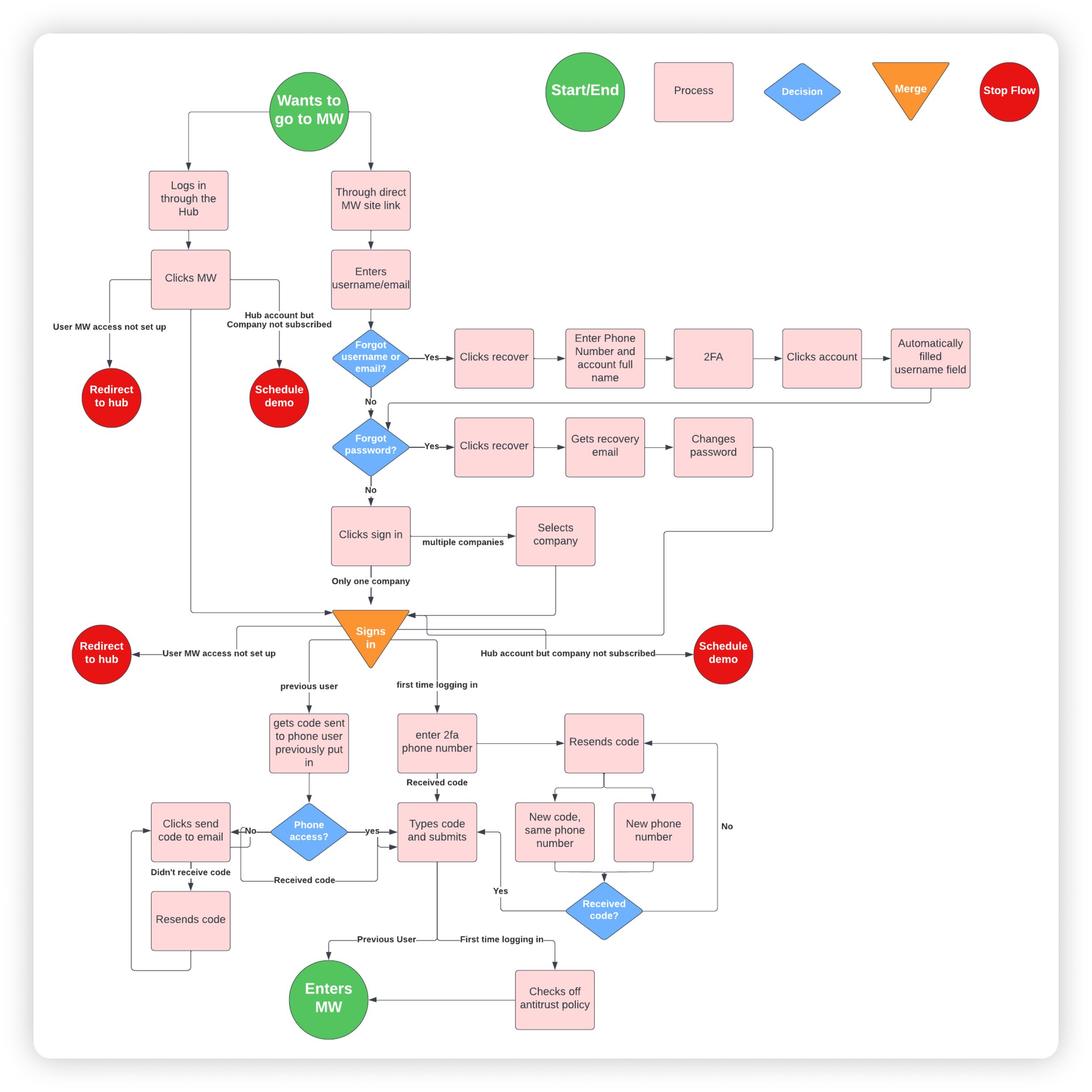
The current login process was overly complex.
Users had two ways of accessing the login page
If it was a user’s first time logging in, they would need to enter their phone number for 2FA .
We needed a way for tech admin users to access different companies.
Anti-trust policy had to be checked after every part of the login process no matter first time sign in or previous user.
This was only the beginning
This was one of many projects I was a part of before being affected by a round of layoffs. If I were still there, here’s what I would’ve like to do:
Design
Finish creating the user permissions, subscriptions, account setting, and homepage
Research
Begin research on what users value most about MarketWatch and how we could improve their experience
Accessibility
Propose design system colors updates to meet ADA/WCAG standards.

Thanks for joining me!
Like what you see? Let’s connect or explore more of my work.


